Rows: 50 Columns: 1
── Column specification ────────────────────────────────────────────────────────
Delimiter: ","
dbl (1): ppg

ℹ Use `spec()` to retrieve the full column specification for this data.
ℹ Specify the column types or set `show_col_types = FALSE` to quiet this message.
Conclude the Null Hypothesis
To start this activity, we are going to demonstrate why we can never conclude the null hypothesis. We will use the airbrb data set for this demonstration.
Decisions are always in terms of the null hypothesis, but we can never conclude the null hypothesis…. why?
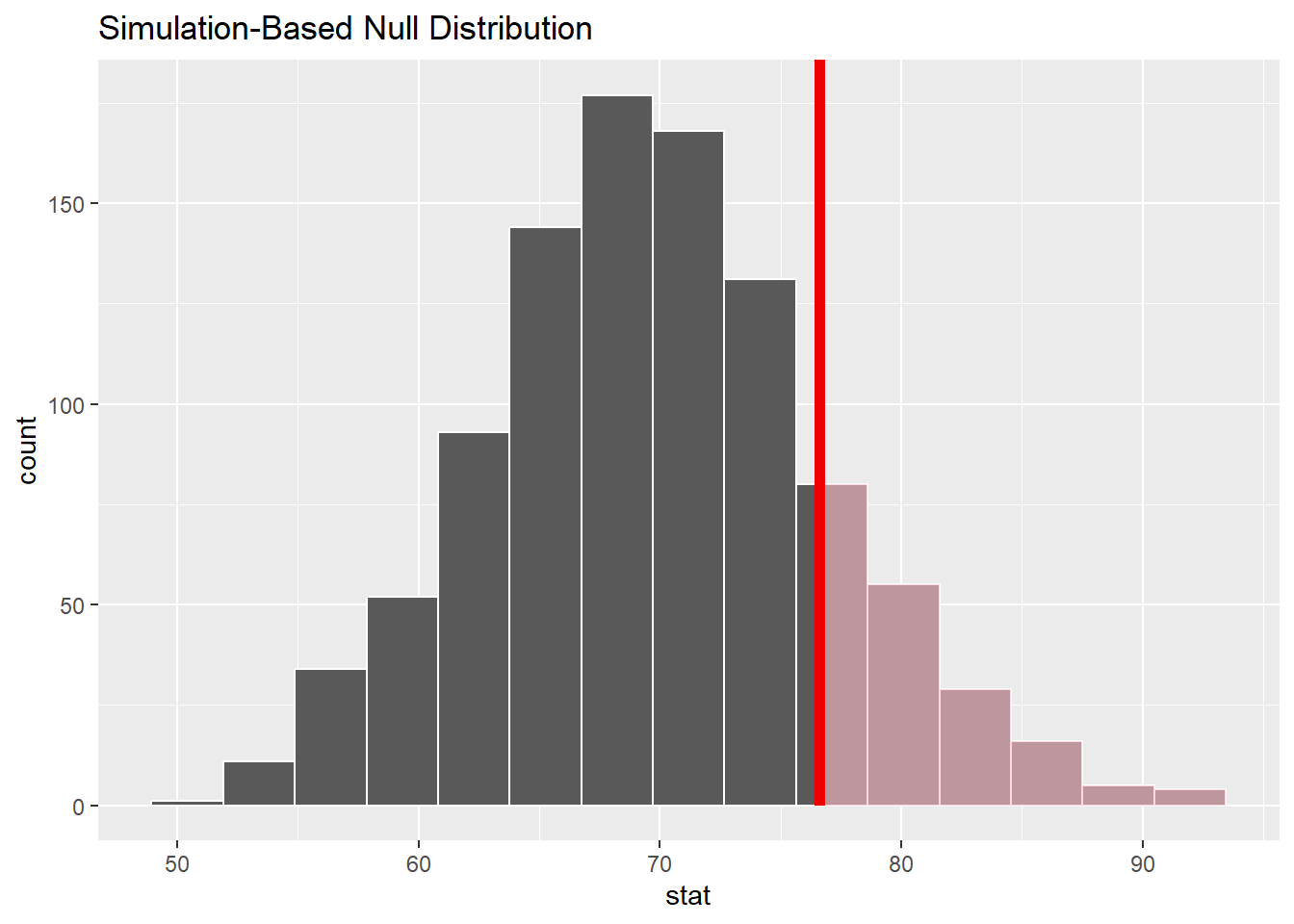
Let’s assume your null hypothesis for the Airbnb question is: \(\mu\) = 70, and you are interested in \(\mu\) > 70
null_dist2<-abb|>specify(response =ppg)|>hypothesize(null ="point", mu =70)|>generate(reps =1000, type ="bootstrap")|>calculate(stat ="mean")visualize(null_dist2)+shade_p_value(obs_stat =76.6, direction ="greater")
null_dist2|>get_p_value(obs_stat =76.6, direction ="greater")
# A tibble: 1 × 1
  p_value
    <dbl>
1   0.158
So now…. I incorrectly conclude that \(\mu\) = 70.
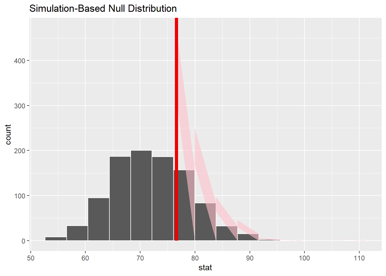
Another research assumes that \(\mu\) = 72….
null_dist3<-abb|>specify(response =ppg)|>hypothesize(null ="point", mu =72)|>generate(reps =1000, type ="bootstrap")|>calculate(stat ="mean")visualize(null_dist3)+shade_p_value(obs_stat =76.6, direction ="greater")
Warning in regularize.values(x, y, ties, missing(ties), na.rm = na.rm):
collapsing to unique 'x' values
null_dist3|>get_p_value(obs_stat =76.6, direction ="greater")
# A tibble: 1 × 1
  p_value
    <dbl>
1   0.263
So now…. I incorrectly conclude that \(\mu\) = 72….??????
Difference in means
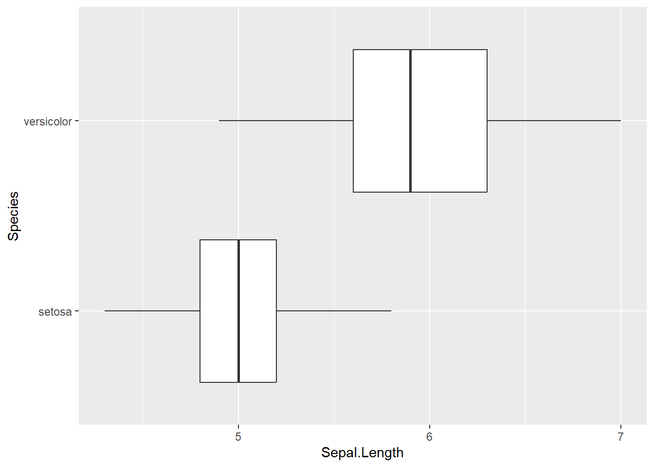
The Iris Dataset contains four features (length and width of sepals and petals) of 50 samples of three species of Iris (Iris setosa, Iris virginica and Iris versicolor). A sepal is the outer parts of the flower (often green and leaf-like) that enclose a developing bud. The petal are parts of a flower that are the pollen producing part of the flower that are often conspicuously colored. The difference between sepals and petals can be seen below.
The data were collected in 1936 at the Gaspé Peninsula, in Canada. For the first question of the exam, you will use this data sets to investigate a variety of relationships to learn more about each of these three flower species. The data set is prepackaged in R, and is called iris.
Goal: Previously, we had conducted a hypothesis test for a single mean (price per guest). Now, we are extending what we know to the difference in mean case.
Specifically, we are going to test for a difference in mean Sepal length between the Setosa and Versicolor.
EDA
First, we want to filter the data set to only contain our two Species. Please create a new data set that achieves this below.
# A tibble: 2 × 2
  Species    count
  <fct>      <int>
1 setosa        50
2 versicolor    50
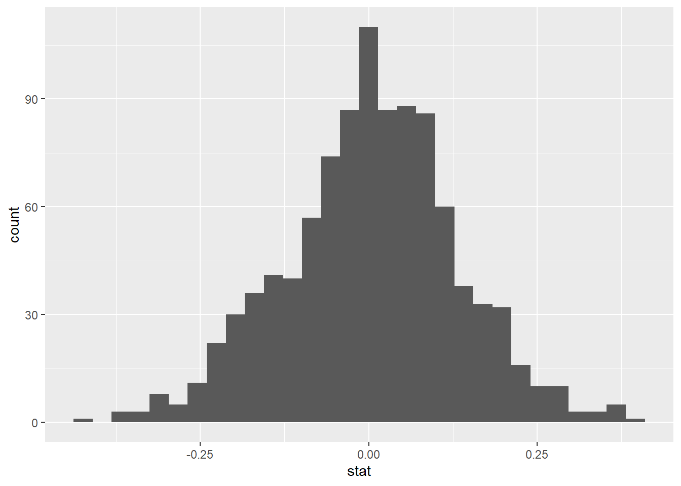
How do we generate the null distribution? Detail the steps below.
– PERMUTE or shuffle all observations together, regardless of their original species
– Distribute observations into two new groups of size n1 = 50 and size n2 = 50
– Calculate the new sample means for each group
– Subtract the new sample means
Now, let’s do the above process many many times…
null_dist<-iris_filter|>specify(response =Sepal.Length, explanatory =Species)|>hypothesize(null ="independence")|>generate(reps =1000, type ="permute")|>calculate(stat ="diff in means", order =c("setosa", "versicolor"))
Dropping unused factor levels virginica from the supplied explanatory variable 'Species'.
Visualize
Now, create an appropriate visualization fo your null distribution. Where is this distribution centered? Why does this make sense?
`stat_bin()` using `bins = 30`. Pick better value with `binwidth`.
This distribution is centered roughly at 0. This makes sense because we assume that the null hypothesis is true.
Now, add a vertical line on your null distribution that represents your sample statistic. Based on the position of this line, do you your sample mean is an unusual observation under the assumption of the null hypothesis?
`stat_bin()` using `bins = 30`. Pick better value with `binwidth`.
Calculate your p-value below
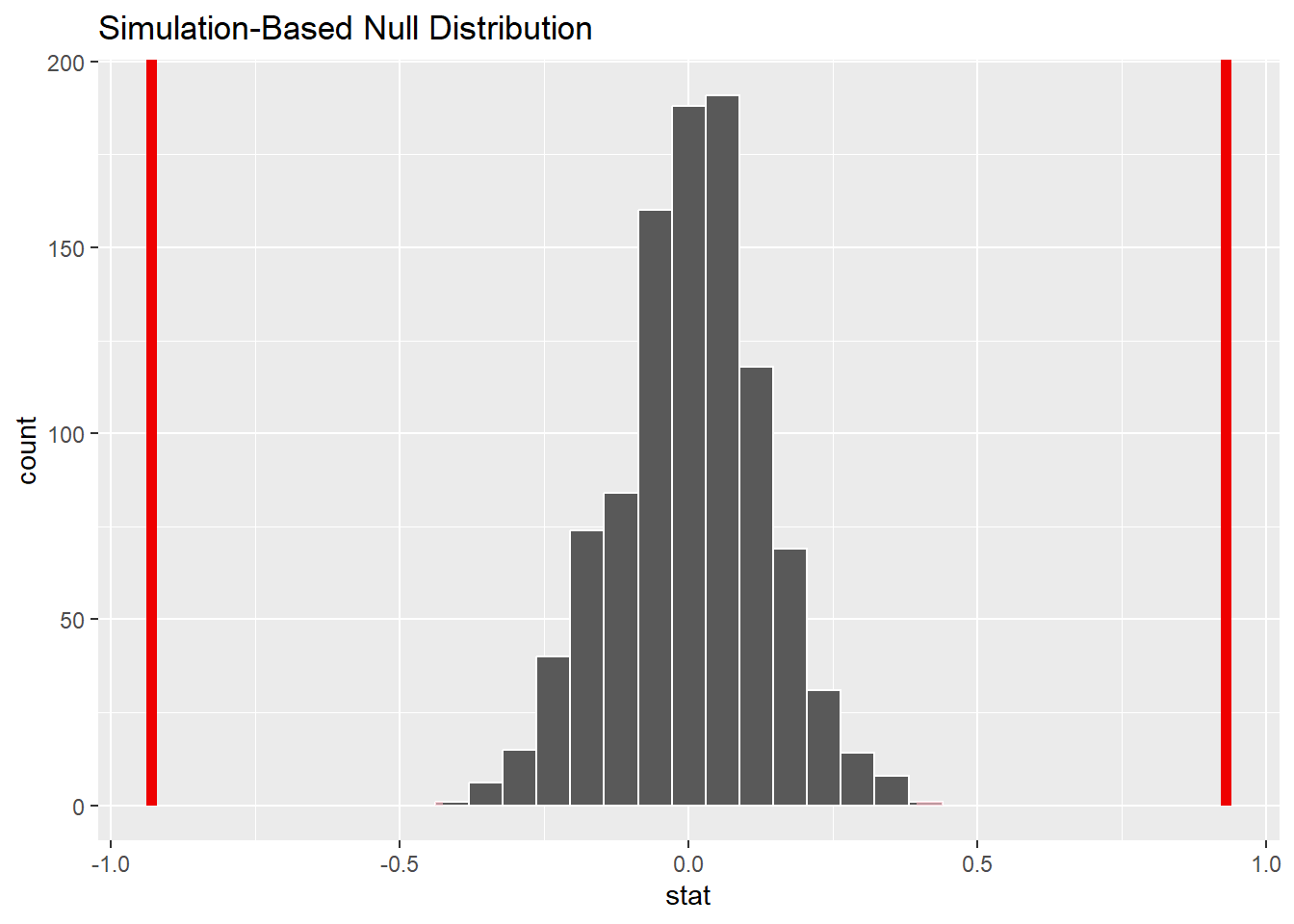
null_dist|>get_p_value(obs_stat =-0.93, direction ="two sided")
Warning: Please be cautious in reporting a p-value of 0. This result is an
approximation based on the number of `reps` chosen in the `generate()` step. See
`?get_p_value()` for more information.
# A tibble: 1 × 1
  p_value
    <dbl>
1       0
<0.001
And visualize it..
Let’s visualize it!
visualize(null_dist)+shade_p_value(obs_stat =-0.93, direction ="two sided")+shade_p_value(obs_stat =0.93, direction ="two sided")