library(tidyverse)
library(palmerpenguins) #The data set name is penguinsVisualizing Penguins - Suggested Answers
For this ae, we’ll use the tidyverse and palmerpenguins packages.
Packages
Data
The dataset we will visualize is called penguins. Let’s glimpse() at it.
glimpse(penguins)Rows: 344
Columns: 8
$ species <fct> Adelie, Adelie, Adelie, Adelie, Adelie, Adelie, Adel…
$ island <fct> Torgersen, Torgersen, Torgersen, Torgersen, Torgerse…
$ bill_length_mm <dbl> 39.1, 39.5, 40.3, NA, 36.7, 39.3, 38.9, 39.2, 34.1, …
$ bill_depth_mm <dbl> 18.7, 17.4, 18.0, NA, 19.3, 20.6, 17.8, 19.6, 18.1, …
$ flipper_length_mm <int> 181, 186, 195, NA, 193, 190, 181, 195, 193, 190, 186…
$ body_mass_g <int> 3750, 3800, 3250, NA, 3450, 3650, 3625, 4675, 3475, …
$ sex <fct> male, female, female, NA, female, male, female, male…
$ year <int> 2007, 2007, 2007, 2007, 2007, 2007, 2007, 2007, 2007…Visualizing penguin weights - Demo
Useful links:
https://ggplot2.tidyverse.org/reference/
Single variable
Note
Analyzing the a single variable is called univariate analysis.
Create visualizations of the distribution of weights of penguins.
- Make a histogram by filling in the
...with the appropriate arguments. Set an appropriate binwidth.
penguins |>
  ggplot(
       aes(x = body_mass_g)) + #type variable name here
       geom_histogram(binwidth = 300) #type geom here
Warning: Removed 2 rows containing non-finite values (`stat_bin()`).
- Now, make a boxplot of
weights of penguins.
penguins |>
  ggplot(
    aes(x = body_mass_g)) +
    geom_boxplot()
Warning: Removed 2 rows containing non-finite values (`stat_boxplot()`).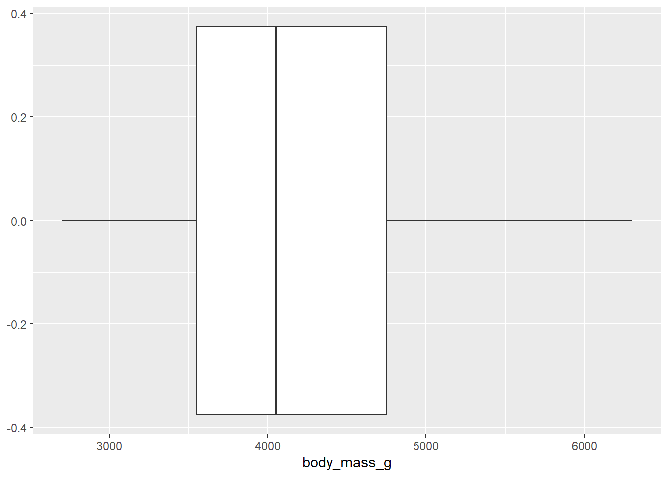
——————————– Answer for #2 Below
- Add a theme to your boxplot! https://ggplot2.tidyverse.org/reference/ggtheme.html
penguins |>
  ggplot(
    aes(x = body_mass_g)) +
    geom_boxplot() +
    theme_dark() # type theme here
Warning: Removed 2 rows containing non-finite values (`stat_boxplot()`).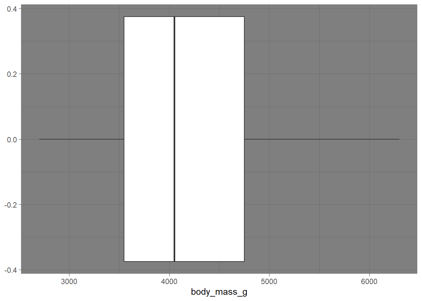
Two variables
Note
Analyzing the relationship between two variables is called bivariate analysis.
Create visualizations of the distribution of weights of penguins by species. Note: aesthetic is a visual property of one of the objects in your plot. Aesthetic options are:
- shape
- color
- size
- fill
- Make a histogram of penguins’ weight where the bars are filled in by species type. Set an appropriate binwidth and alpha value.
penguins |>
  ggplot(
       aes(x = body_mass_g, color = species )) +
       geom_histogram(binwidth = 200, alpha = 1)
Warning: Removed 2 rows containing non-finite values (`stat_bin()`).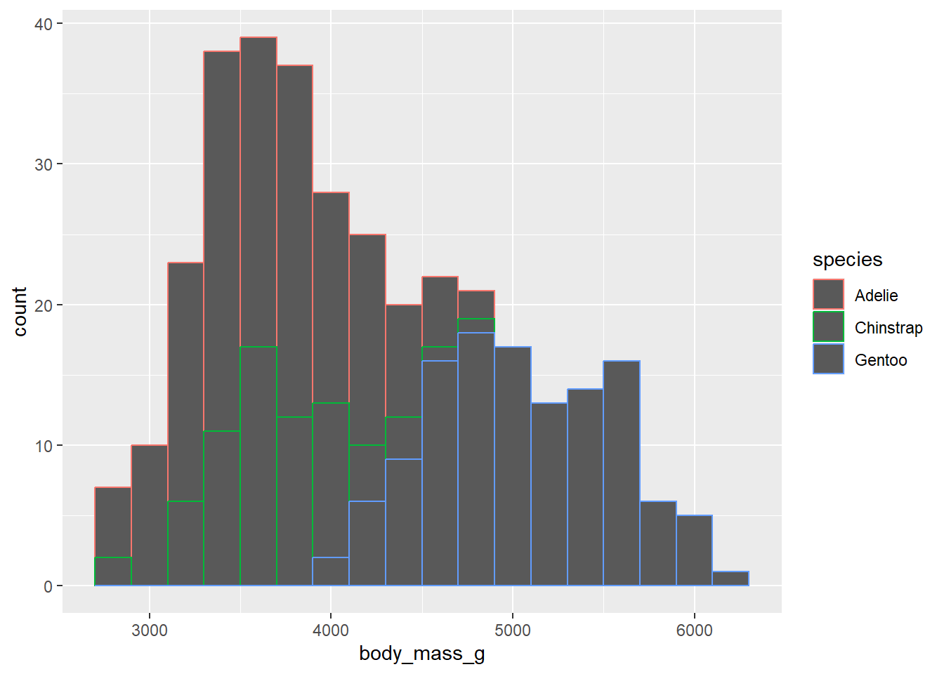
- What if we don’t want the overlap? We can use
facet_wrapto split the histograms apart! This function takes the name of the variable you want to split by, and how many cols/rows you want your plots to show up in.
penguins |>
  ggplot(
       aes(x = body_mass_g, fill = species )) +
       geom_histogram(binwidth = 200, alpha = .7) +
       facet_wrap("species", ncol = 1)
Warning: Removed 2 rows containing non-finite values (`stat_bin()`).
- Create side-by-side boxplots to compare body mass across species. Turn off the legend so it is not displayed.
penguins |>
  ggplot(
    aes(x = body_mass_g, y = species)) +
    geom_boxplot(show.legend = F)
Warning: Removed 2 rows containing non-finite values (`stat_boxplot()`).
- We need to think critically about color when thinking about creating visualizations for a larger audience: https://ggplot2.tidyverse.org/reference/scale_viridis.html
We can create a colorblind friendly pallet using scale_colour_viridis_d(). Comment the code below to describe what it’s doing:
p <- penguins |>
  ggplot(
    aes(x = body_mass_g, y = bill_length_mm , color = species)
  ) +
    geom_point()


p
Warning: Removed 2 rows containing missing values (`geom_point()`).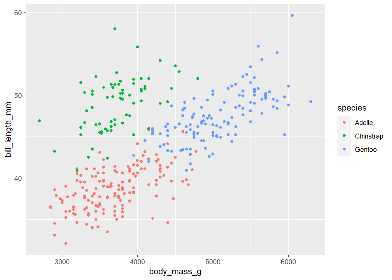
p + scale_colour_viridis_d()Warning: Removed 2 rows containing missing values (`geom_point()`).
- Let’s use multiple geoms on a single plot. Be deliberate about the order of plotting. Our task is to recreate the following image below. Hint: This plot uses
theme_minimalandscale_color_viridis_d(option = "D").
Note: Themes are a powerful way to customize the non-data components of your plots: i.e. titles, labels, fonts, background, gridlines, and legends: theme().

penguins |>
  ggplot(
       aes(x = body_mass_g, y = species, color = species)) +
  geom_boxplot(binwidth = 500) +
  geom_jitter() +
  scale_color_viridis_d(option = "D", end = 0.8) +
  theme_minimal() +
  labs(x= "Weight",
       y = "Species",
       title= "Weight Disrtribution of Penguins") +
  theme(legend.position = "None")
Warning in geom_boxplot(binwidth = 500): Ignoring unknown parameters: `binwidth`Warning: Removed 2 rows containing non-finite values (`stat_boxplot()`).Warning: Removed 2 rows containing missing values (`geom_point()`).
Optional
Make your own plot! Revist the geoms page here: https://ggplot2.tidyverse.org/reference/
Here is a cool one!
ggplot(penguins,
       aes(x = species, fill = sex)) +
  geom_bar(show.legend = T) +
  scale_color_viridis_d(option = "D", end = 0.8) +
  theme_minimal() +
  labs(
    x = "Species by Sex",
    title = "Penguins by species and sex"
  )